ROOSROAST COFFEE
Bringing the vibrance of RoosRoast Coffee into the online shopping experience.
SKILLS
UX/UI Design / Research
E-Commerce Design / Research
Branding
TOOLS
Figma
Adobe Illustrator
Baymard Institute
TEAM
Emily Veguilla
Bella Mai
TIMELINE
January - March 2024
THE BACKGROUND
Known for its unique blends, welcoming atmosphere, and strong community presence, RoosRoast has become a staple in the vibrant coffee culture of
Ann Arbor, MI.
Catering to a diverse range of customers, including students, professionals, families, and coffee lovers with its eclectic décor, friendly staff, and commitment to quality, the shop appeals to both regulars seeking their daily caffeine fix and tourists exploring the city's culinary scene.
With its expansion into the online realm, RoosRoast requires a website that exemplifies its atmosphere and impact on the community.
CURRENT CHALLENGES
-
The existing website is currently facing challenges in delivering a coherent user journey and is missing aesthetic attractiveness.
Our Goals:
- Restructure the sites navigation bar to prioritize specific pages
- Implement chunking on detailed pages to help breakdown information
-
Currently, the website utilizes colors and fonts that are inconsistent and not reflective of the in person RoosRoast experience.
Our Goals:
- Select a new sans serif typeface that is both fun and legible
- Incorporate a new color scheme reflective of those seen in store
- Use consistent icons and buttons across site pages
-
Above all else, the biggest thing the RoosRoast website is missing is the authentic RoosRoast personality.
Our Goals:
- Incorporate language seen on RoosRoast packaging and heard in store
- Add new, updated imagery that is reflective of the fun Roos atmosphere
- Highlight imagery seen in store and across Roos social media
THE RESEARCH PHASE
Benchmarking
One of the earliest steps in the research phase was Benchmarking. In this stage, I began to dive in deeper into the world of coffee and e-commerce and conducted a thorough competitive analysis on analogous coffee shops across the US with a focus on their landing, subscription, and wholesale pages.
Competitive Reviews
Beyond benchmarking, we took a deeper dive into the subscription and wholesale pages of some of our competitors to analyze their strengths and weaknesses.
MID-FI WIREFRAMES
Mobile
Website
THE STYLE GUIDE
About our choices…
Fun & Bold title fonts communicate Roos’ eccentric vibe while keeping it legible
Bold colors to reflect Roos’ bold flavors
Incorporation of Roos’ classic logos to connect with in person iconography
FINAL KEY FEATURES—
1. MORE ROO IN THE ROOSROAST ONLINE EXPERIENCE
Visuals reminiscent of iconography and design seen in person.
Incorporation of quirky language to capture more personality
Background Info on how RoosRoast came to be!
2. IMPROVED INFORMATION ARCHITECTURE
Streamlined navigation bar
Consistent iconography and colors
Familiar labels and categories
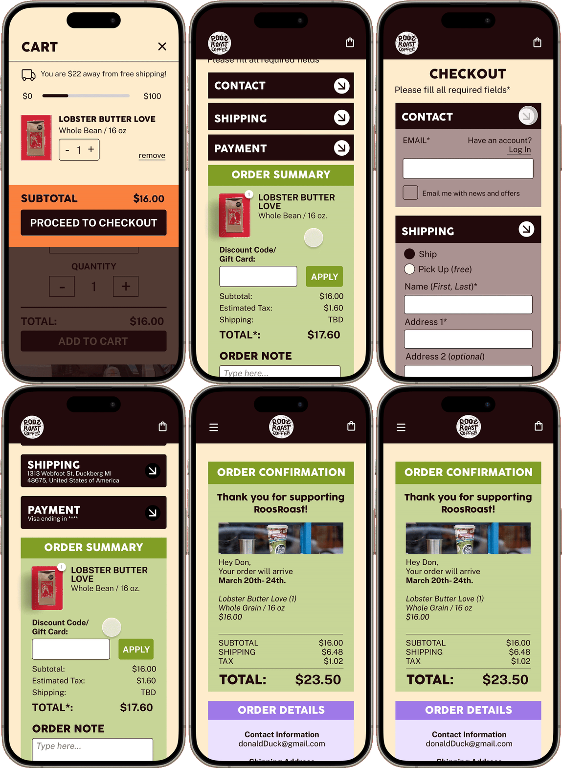
3. BRAND NEW CHECKOUT EXPERIENCE
Chunking to limit the number of prompts shown at once
Dropdown menus
THE PROTOTYPE
Vibrant personality on the homepage
Filters to sort through product options
Chunked checkout process
Visual details about each product’s background
Convenient menus to navigate and see what’s in your cart
BEYOND THE DESIGN
This opportunity was brought to life at the University of Michigan - School of Information for the course “SI 311 - Laws of UX” taught by professor James Rampton. For this assignment we were divided into teams to reimagine and redesign RoosRoast’s current website and E-Commerce experience. We then presented each of our designs to John Roos and the RoosRoast team.
Following these presentations by ~30 teams, Bella and I’s work was chosen as RoosRoasts’ Favorite Design.
Below you can watch and read about our design process and even hear from the RoosRoast' team!
Like what you saw? You’ll love these projects too!


